OpenRouter AI Model Rankings
A critique of OpenRouter's interactive rankings page, which combines usage trends, market share, and benchmarks for large language models.
View source visualizationPurpose
The purpose of this visualization is to help people compare AI models from the perspective of adoption and capability. The usage views answer which models and providers are currently getting traffic on OpenRouter, while the benchmark view helps users think about performance per dollar and other metrics. It is partly a public market snapshot and also a shopping tool for choosing a model.
Data
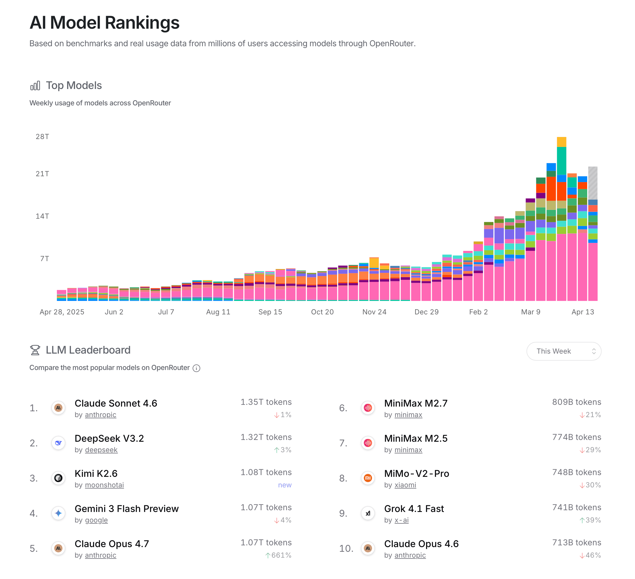
The visualization uses OpenRouter platform usage data, shown as token volume by model and market share by provider. The page describes the rankings as being based on benchmarks and real usage data from users accessing models through OpenRouter. In practice, that means the usage data is captured as requests flow through the OpenRouter API, then aggregated into weekly totals, provider shares, and leaderboard positions.
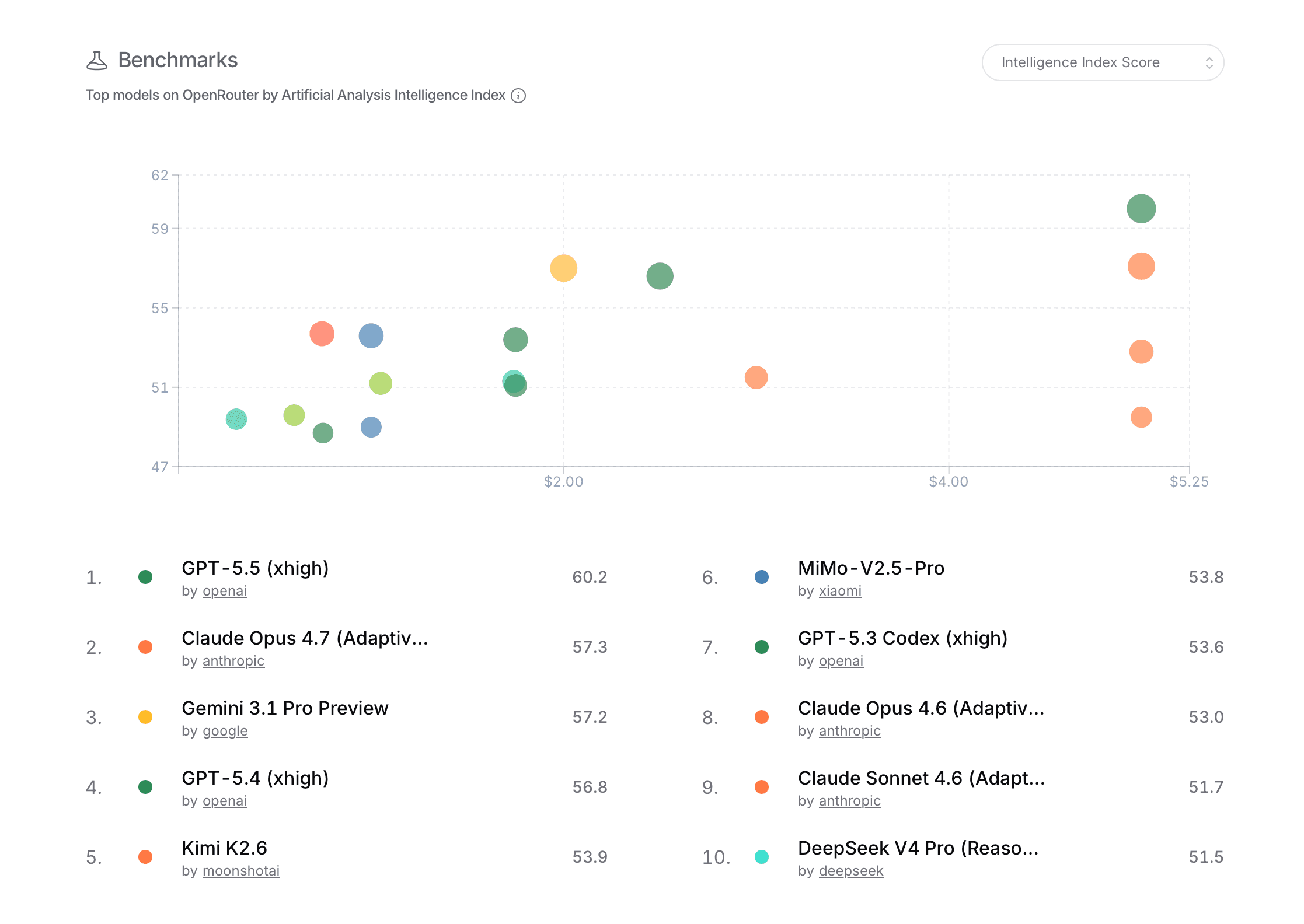
The benchmark scatterplot adds model evaluation scores and price, so it combines operational platform data with external or internally compiled model metrics.
Users
The primary users are people who already understand LLM providers and model tradeoffs, and are interested in the market share of models and providers. This could be developers choosing a default model for their app, people watching the market, AI researchers tracking adoption, and many others. The page is readable for the general public, but the terms "tokens," model names, provider names, benchmark scores, and pricing axes assume some familiarity with AI tooling.
Questions And Insights
A user can ask which models are being used the most right now. The leaderboard answers this directly with rank, provider, weekly token volume, and week-over-week change. In the captured overview, Claude Sonnet 4.6 and DeepSeek V3.2 appear near the top of previously shown model usage graph, suggesting that current usage is not concentrated in one provider only.
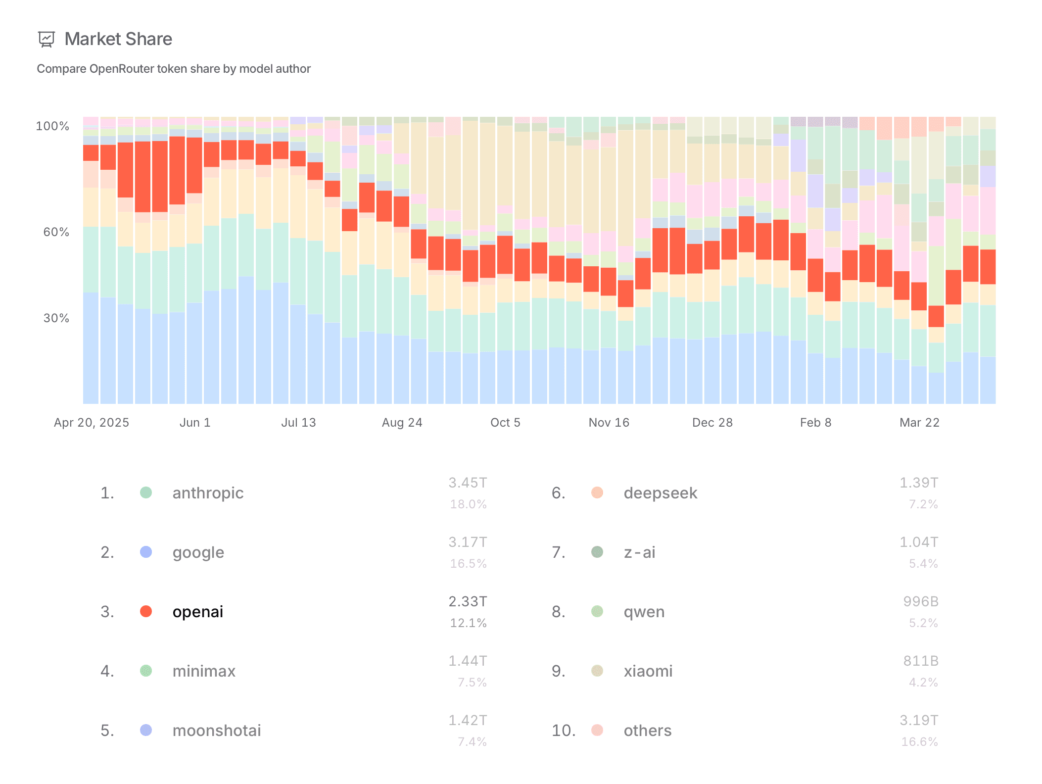
A user can also ask which providers dominate total usage. The market-share view pairs a stacked timeline with exact provider totals. Anthropic, Google, and OpenAI occupy large shares, but the "others" category is also substantial, which is not surprising given the fragmentation of the market, but is also not very helpful.
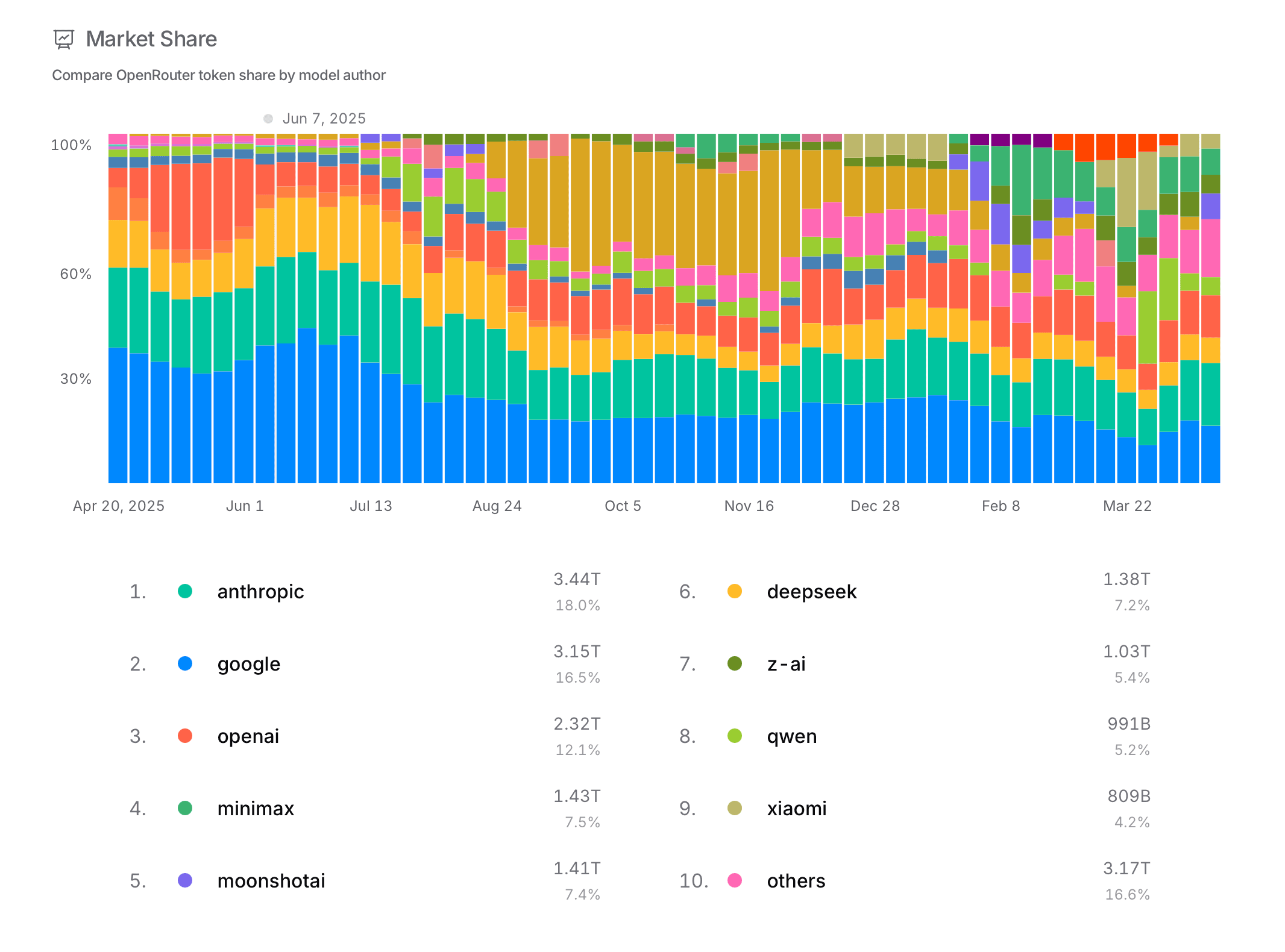
The stacked bars also help answer whether the market is stable. The changing colored bands show visible shifts across weeks, especially when new releases enter the ranking.
Interaction Design
The strongest design choice is the use of stacked time-series bars for market share and other metrics. This really shows the instability of the AI model market. Users can see dominant providers, smaller competitors, and sudden shifts in the same view. It is a good fit for data where we are not only interested in the current state, but how the balance of the chosen metric changes over time.
The main weakness is discoverability. Provider rows can be selected, metric menus can be changed, and leaderboard periods can be adjusted, yet the interface does not strongly preview what those controls will change. Selecting a provider creates a clear focus state in the list, but the chart itself could do more to isolate that provider's history.
The market-share colors also become difficult to track when many providers are present. A stronger hover state, a persistent legend, or a way to temporarily isolate one provider in the stacked chart would make the trend analysis much easier.
Benchmark View
The benchmark scatterplot changes the task from popularity analysis to tradeoff analysis. Users can look for dots high on the chart and farther left on the price axis to identify models that look efficient rather than merely powerful. This makes it possible to separate "popular now" from "best score for the price."
Limitations
The visualization shows OpenRouter usage, not the entire AI market. It is a useful proxy, but it may overrepresent communities and apps that already route through OpenRouter.
Users cannot easily compare an arbitrary set of models side by side across all metrics. The page is built around ranked views, not custom analysis. The stacked market-share chart makes total composition visible, but it is hard to follow smaller providers over time without stronger highlighting or filtering.
Benchmark scores are simplified into a single plotted value. That is useful for scanning, but it hides task-specific strengths, latency, context length, reliability, and qualitative behavior. The mobile layout is clean, but it compresses dense charts into a narrow space, making precise comparison harder.